

Website Redesign for C4C
A complete Renewal of experience:
Collaboration with Code4Community
Role Timeline Skills Tools Team
UX/UI Designer
Dec 2023
UX/UI Design
Figma
Ruohan Li
User Research
Angeli Liu
Xiao Qian
Visual Design
Project Overview💻
Code4Community is a Northeastern organization that collaborates with non-profit organizations across the country. I co-redesigned the website pages to create better navigation for students and clients while reinforcing the brand element.
In our Core-Infrastructure team:
👩🎨
👩💼
🧑💻
3 Designers
1 Project
Manager
4 Developers
🔍 Defining the Problem:
The current website lacks interactive features showcasing the brand image and fails to create an engaging experience for applicants and clients.
1. Limited Brand Representation
2. Reduced User Engagement
3. Outdated UI
The pages lack a clear visual identity that conveys the club's image.
lack interactive elements and multimedia content, limiting further collaboration.
The UI element are overly simplified.


🧐 Then we digged deeper
To learn more about the user and empathize with their problems and their contexts of wants and needs, we conducted over 20 interviews with different roles.


“I think our website has a simplistic style, but I don’t see much information showcasing our work.”
Alice, Developer of C4C
Evan, Designer of Generate
“I also applied to C4C two years ago. Comparing to Generate’s website, I think there could be more interactive features or information sorting.”

Dave, Non-profit collaborator
"The general experience was great, but when I recommended it to other non-profit friends, they told me they wished there was more info on the web before sending an email."
🏃♀️Sprint 1: Information Architecture
To organize and define the structure of the website, we produced a sitemap that identifies the information hierarchy and connection of the site.

🏃♀️Sprint 2: Visual Ideation
With the brand's value, we brainstormed different possible visual directions for the website. After rounds of documentation and pitches to the rest of the club, we developed the approach.

🏃♀️Sprint 3: Visual Ideation-Low Fidelity

We Established the basic structure of the pages without any visual consideration and highlighted the function of each page.
We sent this version of the wireframe to engineers for their opinions.
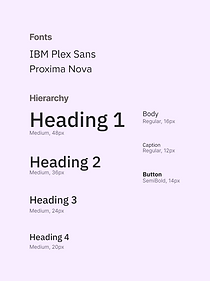
🏃♀️Sprint 4: Design System
Primary Color

Secondary Color

Accent Color


Solution 1:
Engaging Homepage of brand representation
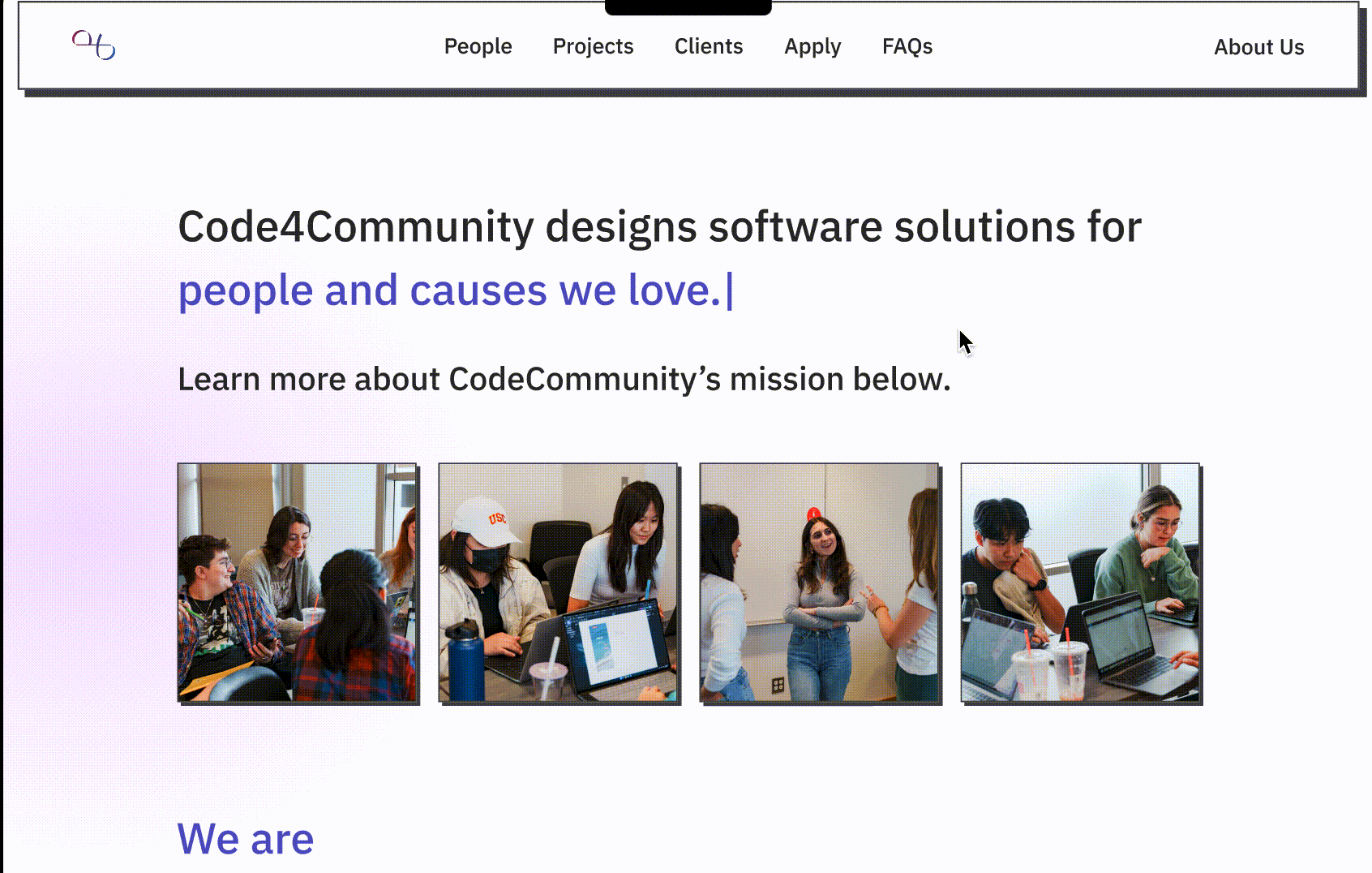
-
Added multi-media materials to emphasize brand image
-
Strengthen information organization with card sorting design to enhance readability.
-
Elevated information hierarchy in visual forms of colors and sizes.
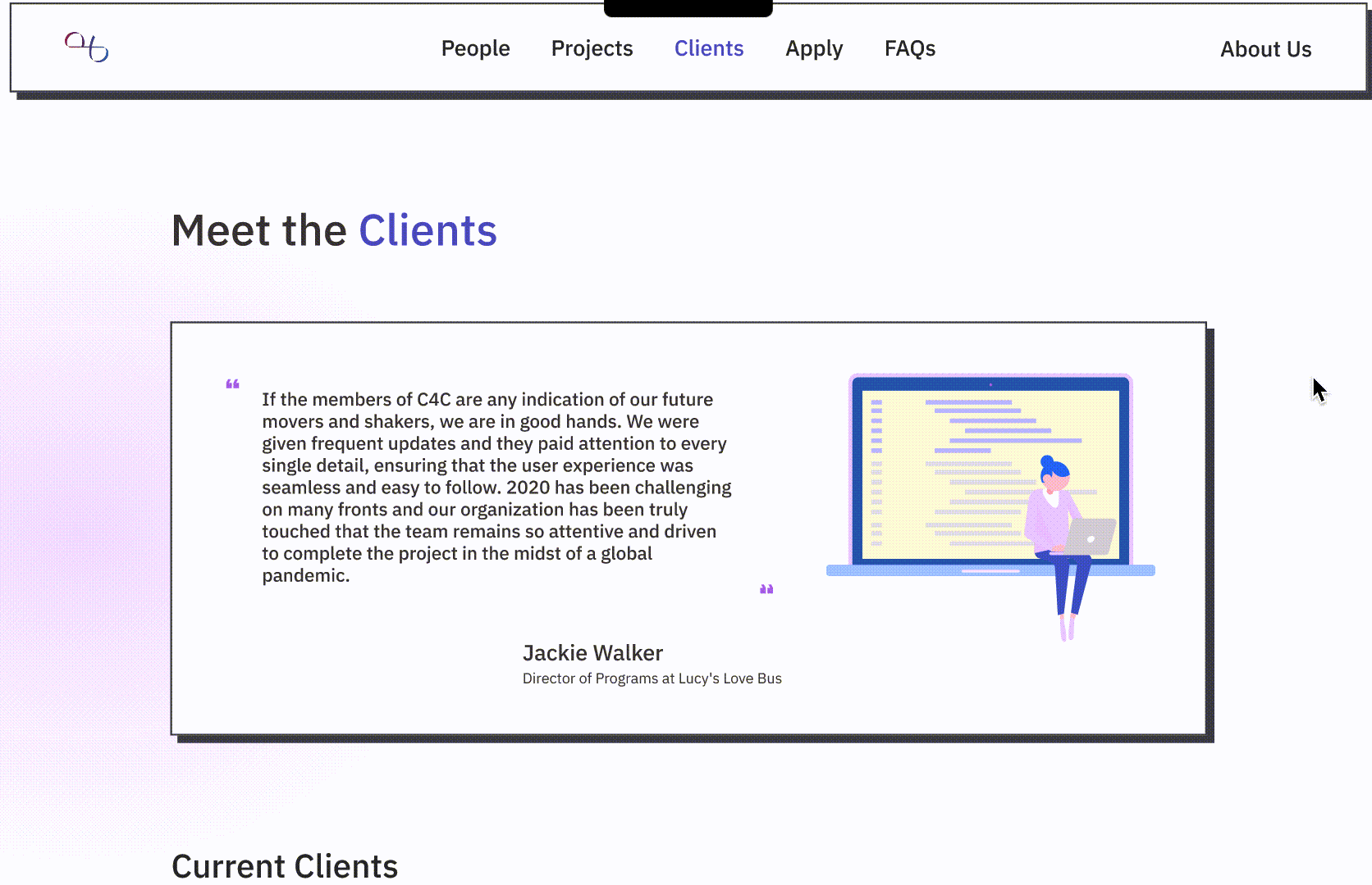
People Page
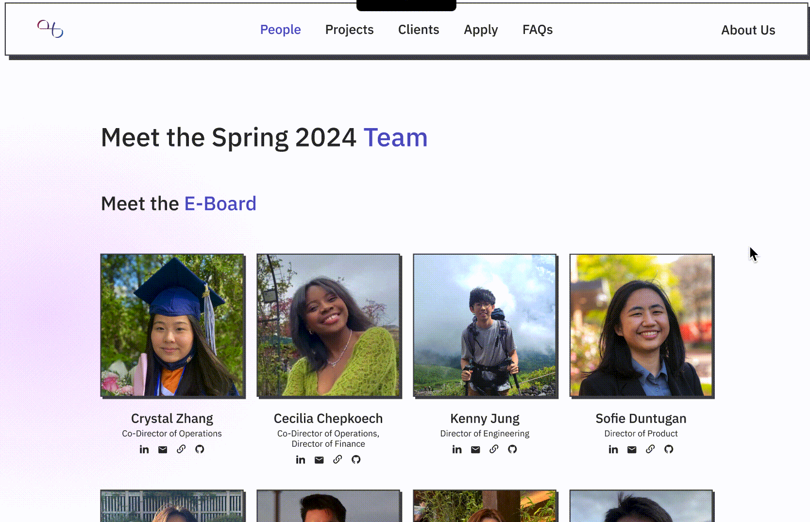
-
Added interactive hover effects and clickable links to improve navigation.
-
Optimized layout with card sorting for better readability.
-
Improved visual hierarchy using spacing, typography, and contrast.
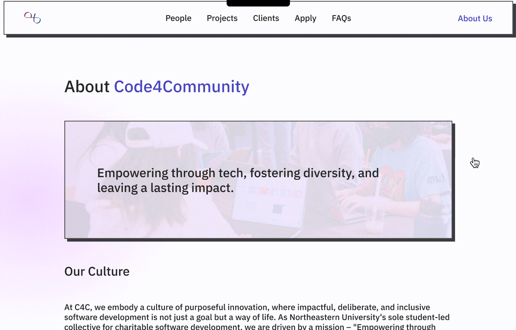
About Page
-
Incorporated interactive elements such as hover effects and click actions for dynamic engagement.
-
Integrated call-to-action buttons to direct users to relevant pages and increase engagement.
-
Added carousel functionality to event sections for seamless browsing of past events.
-
Improved visual hierarchy with clear headings, card designs, and typography to enhance readability.
-
Streamlined project descriptions with concise summaries and dedicated "View Case Study" buttons for detailed exploration.
-
Incorporated hover effects on project cards to provide dynamic feedback and improve engagement.
Project Page
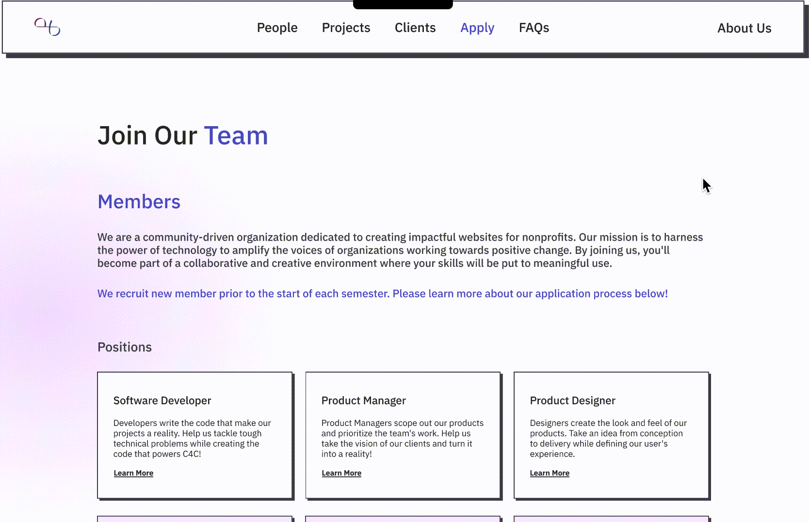
Apply Page
-
Improved position clarity by adding role descriptions and “Learn More” links for each position.
-
Enhanced application flow with clear “Apply Now” buttons for seamless navigation.
-
Integrated a visual application timeline to guide users through key milestones in the process.
Takeways
Open communication is the key
In this project, it requires me to make constant open communication with the other designer, developers and stakeholders, learning about their objectives. Compromising their idea and pitching my perspective.
Quality matters, quantity too
Working on a very design-focused project means creativity is an important key for better results. Therefore, doing multiple iterations of the pages is necessary for great design decisions to sparked.
Reasonable planning for a tight timeline
Having a tight timeline reinforces the need of a reasonable planned timeline for each sprint and ideation stage. Having schedule planned out before initiating the project is important.